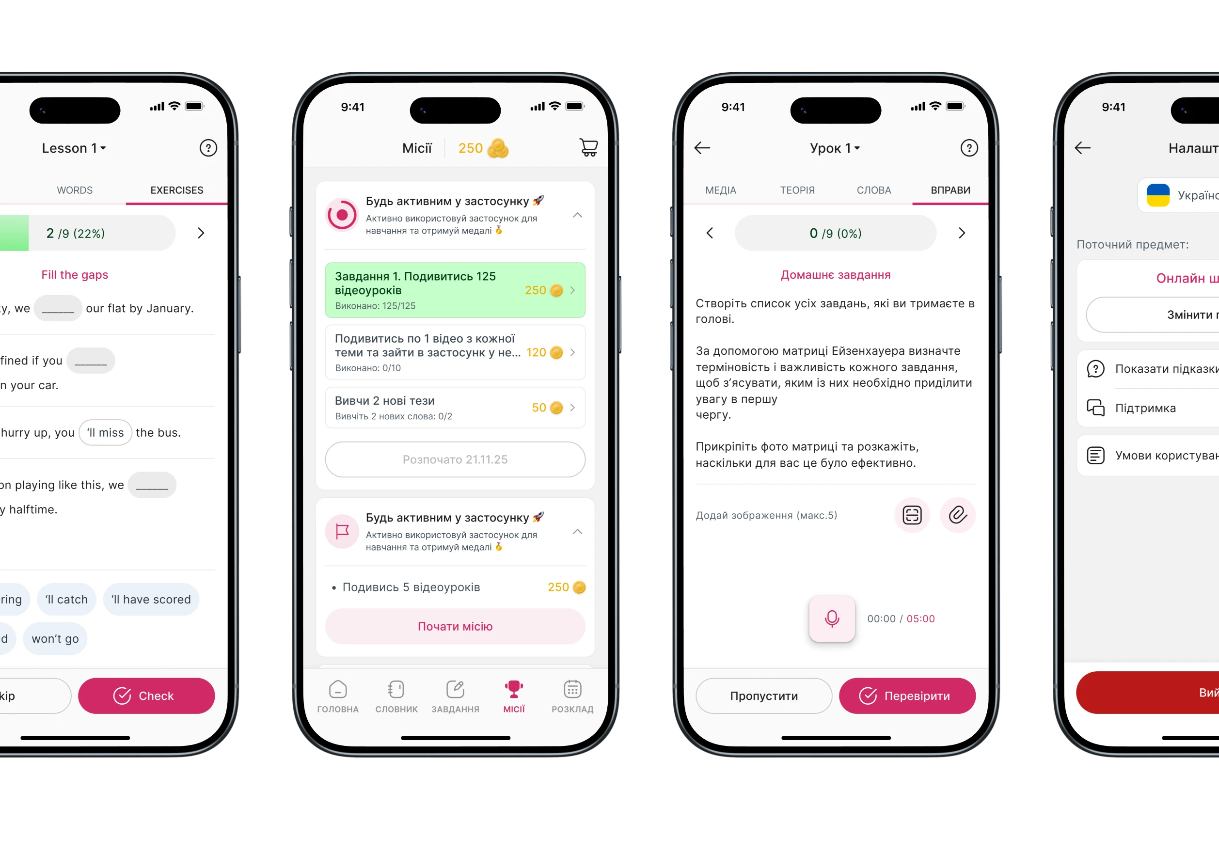
A freelance UX audit + UI redesign for Skillzrun — a white-label LMS platform that lets schools and teachers build and publish their own branded learning apps. The challenge was fixing accumulated inconsistencies across a live product without touching the product logic — only making it cleaner, clearer, and easier to maintain.
Role: UX audit, UI redesign, design system foundations [freelance]
Scope: Mobile app — Component library — Typography & color system — Layout alignment
Context
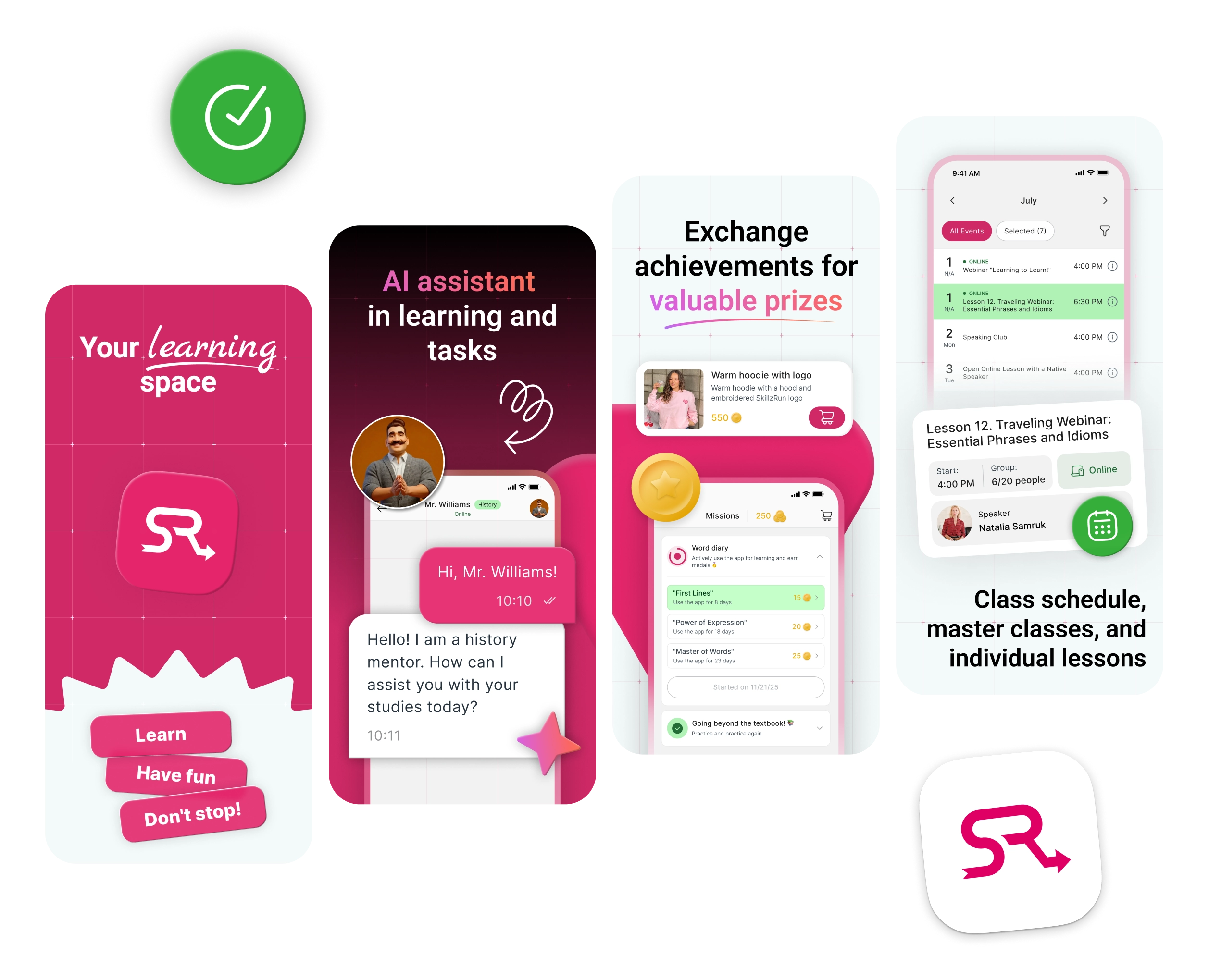
Skillzrun is one of the largest LMS platforms in Ukraine. It lets small schools, independent teachers, and course creators build and publish their own branded learning app — with their logo, their content, distributed through the App Store and Google Play without building anything from scratch.
By the time I joined, the product had grown organically for a while. The codebase had been extended, the UI had been touched by multiple hands, and it showed. Not broken — just rough around the edges. The kind of roughness that quietly makes a product feel less trustworthy than it actually is.
My job was not to redesign the product. It was to make the existing one consistent, readable, and easier to maintain — without touching business logic or introducing new features.
Audit findings
I started with a full audit of the live app before touching anything. The goal was to map recurring problems, not just fix what looked wrong at first glance.
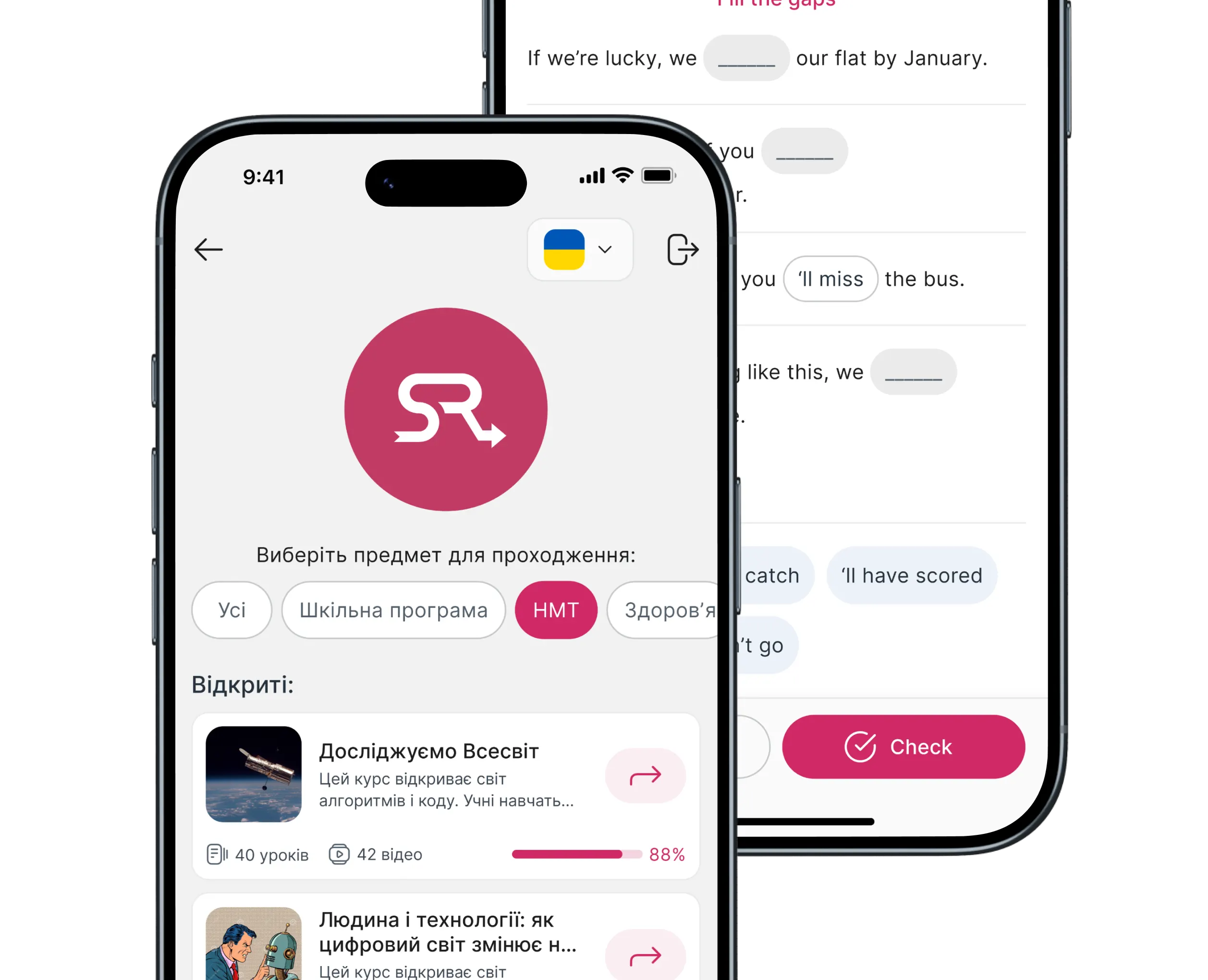
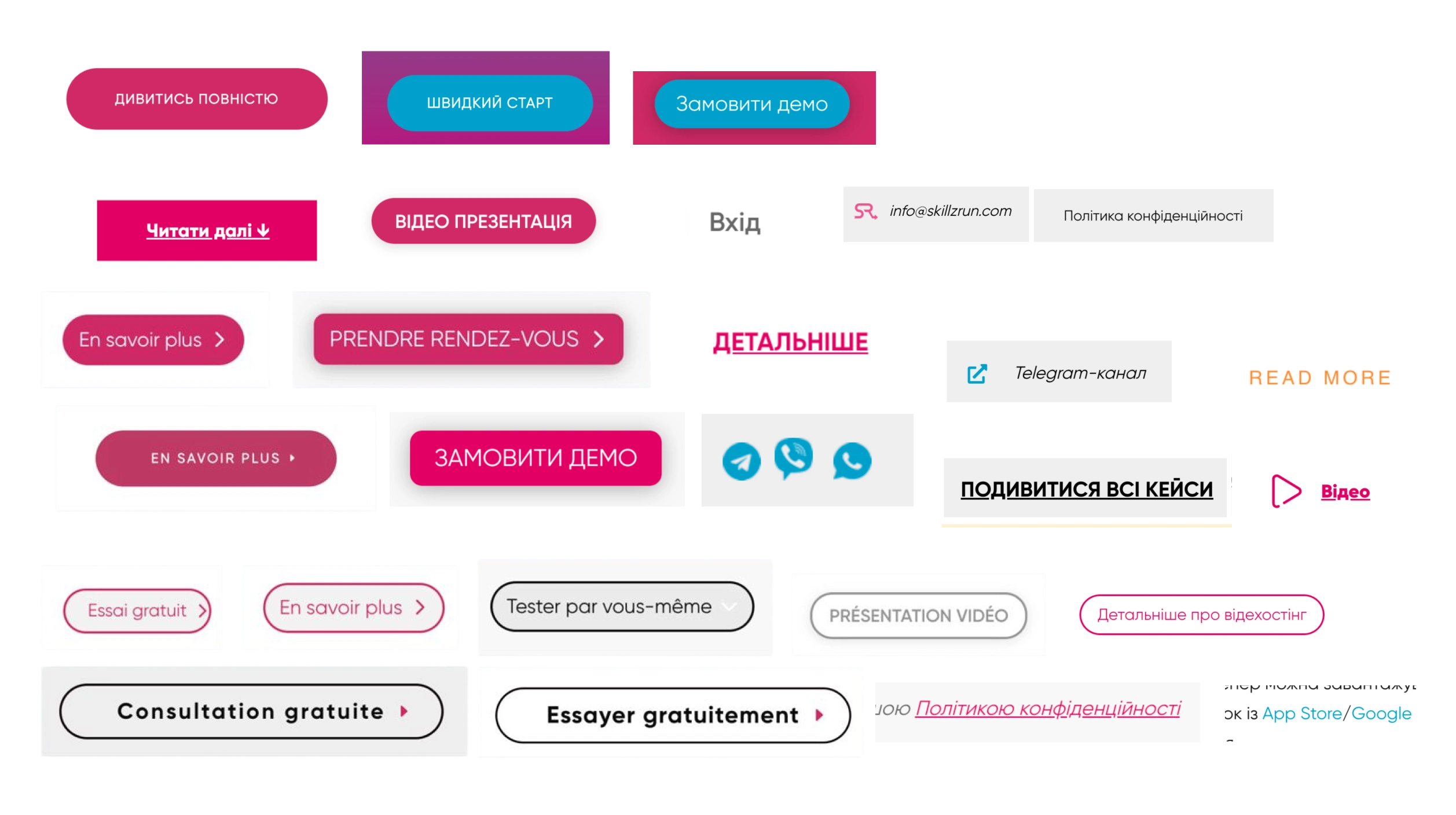
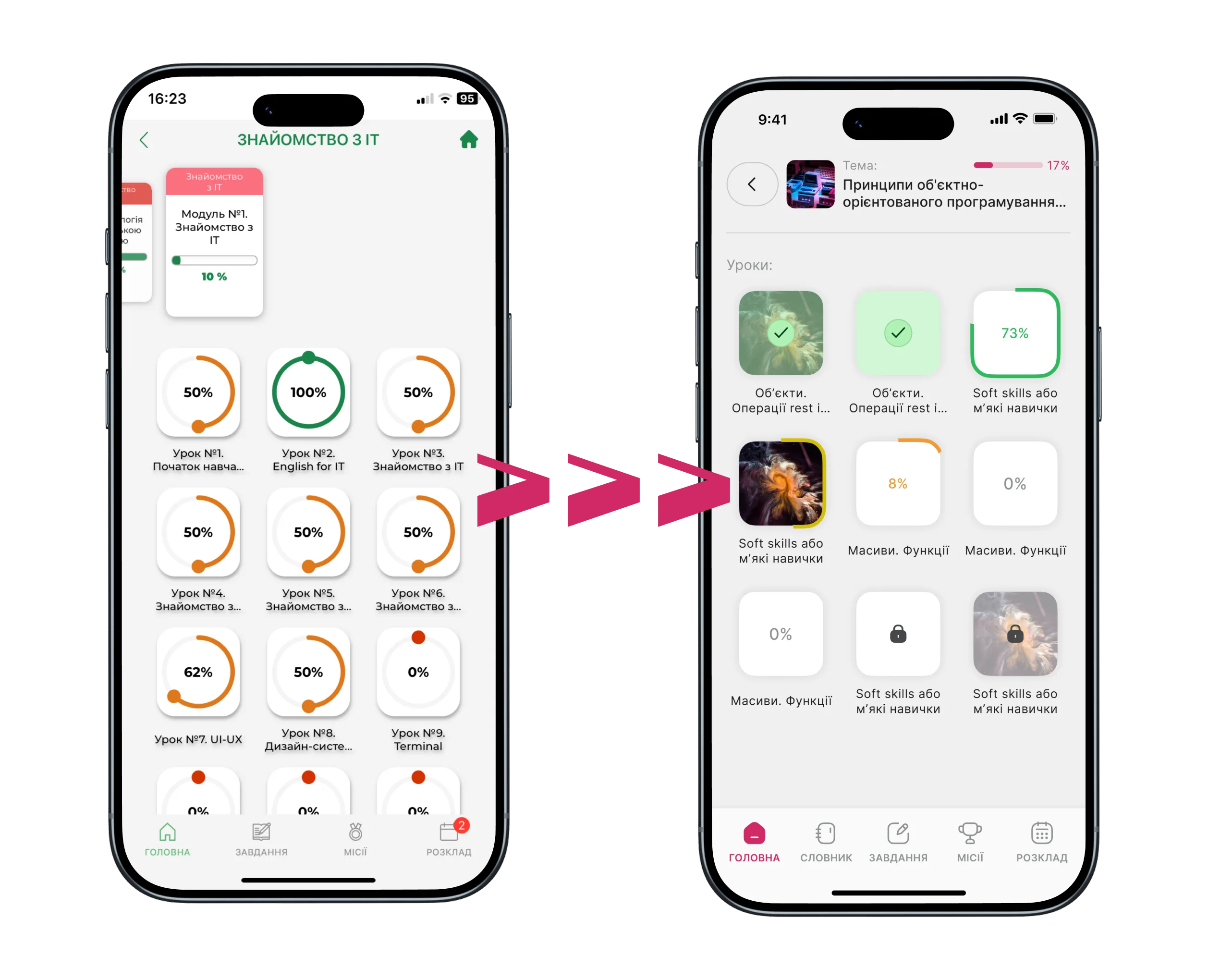
Inconsistent components
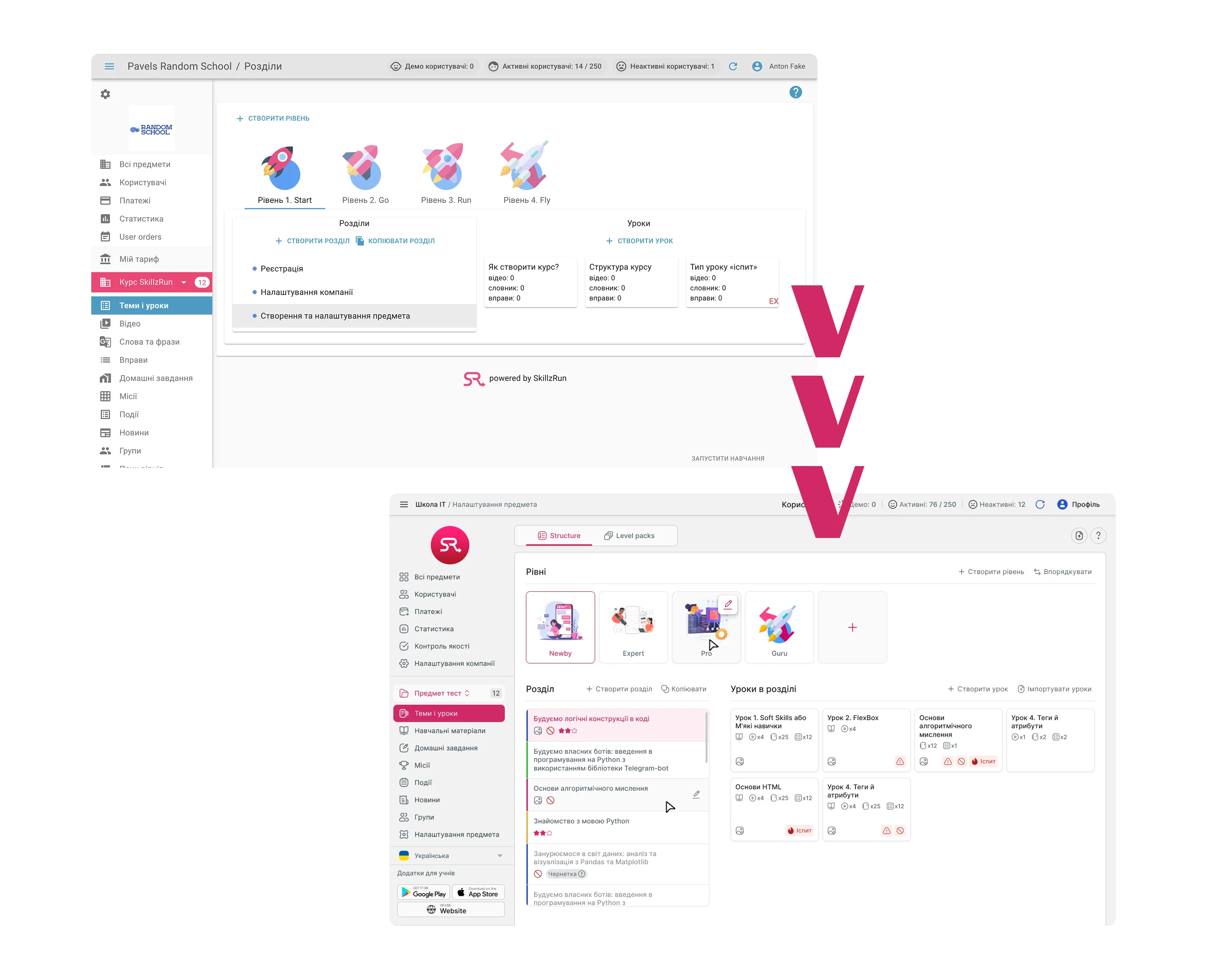
The same UI element — a button, an input, a card — appeared in slightly different sizes, colors, or spacing depending on which screen you were on. No shared source of truth.
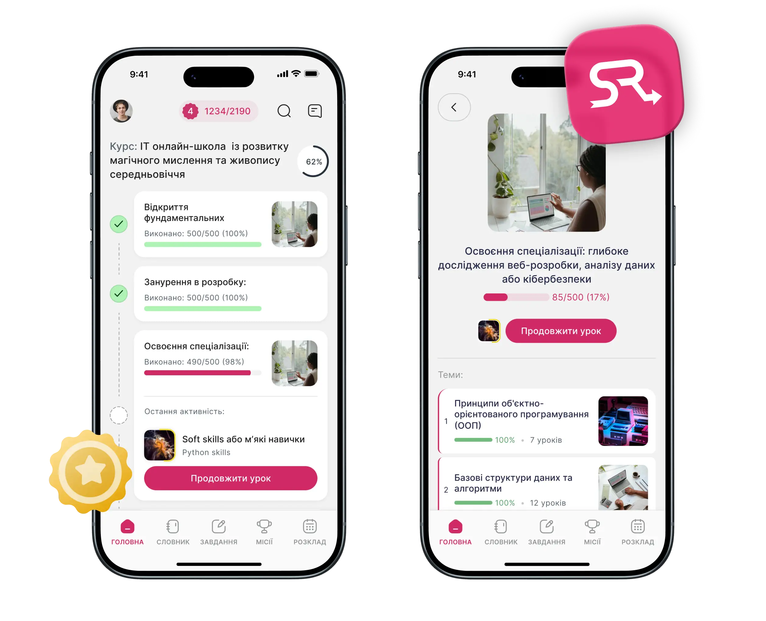
Weak visual hierarchy
Screens had too many elements competing for attention. It was hard to tell what was primary, what was secondary, and what you were supposed to do next.
Contrast & readability
Several text and icon combinations failed basic readability standards. On smaller screens, this made content harder to follow — especially for the educational content that is the core of the product.
Missing component states
Interactive elements often lacked hover, disabled, loading, and empty states. Custom elements were rebuilt from scratch each time instead of reused.
Overloaded screens
Several screens tried to do too much. Dense layouts with no breathing room made scanning difficult, especially on smaller devices.
Constraints
No product strategy changes → scope was strictly UI — business logic and feature set stayed untouched.
Live product with active users → changes had to be backward-compatible and safe to hand off incrementally.
White-label nature → components needed to stay flexible enough to support multiple brand identities, not just one visual style.
No design system existed → building foundations from scratch while auditing a live product at the same time.
Consistency vs. flexibility → the main challenge was introducing visual consistency across the product while keeping layouts and components customizable enough for each client's brand identity.
What I changed
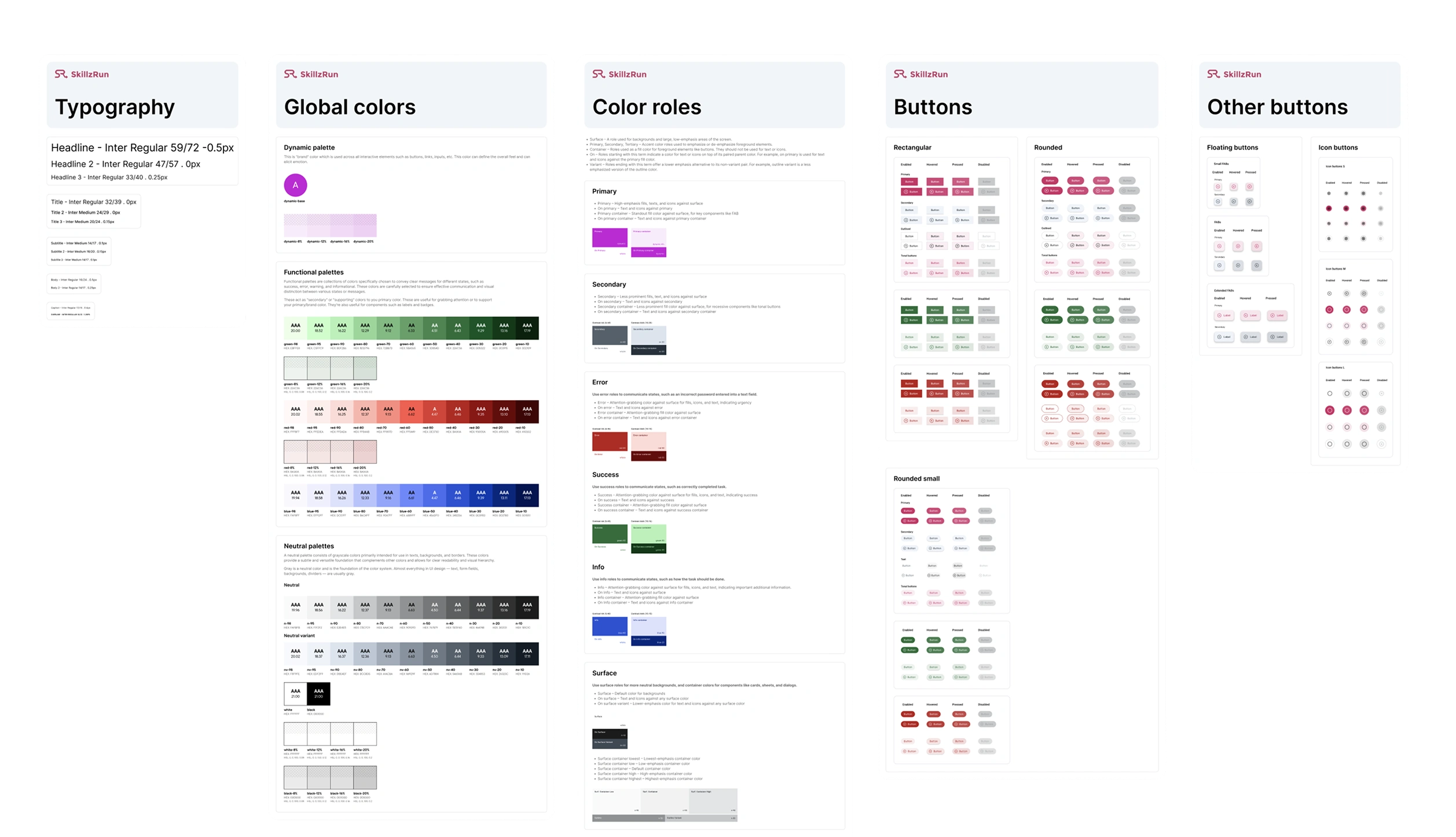
I approached the redesign in layers — starting from the smallest decisions and working outward. Fixing typography and color first meant every component built on top of that was consistent by default.
Typography and color first — I defined a clear type scale and assigned semantic roles to colors: primary, secondary, surface, error, and so on. This gave the whole system a shared language before any component work started.
Component foundation — Buttons, inputs, modals, and a basic icon pack were built as reusable components with all necessary states. Instead of rebuilding the same element ten times, you pick it once from the library and it works everywhere.
Layout alignment — Spacing and grid were standardized across screens. This alone resolved a significant portion of the visual inconsistency — elements stopped feeling like they were placed by feel rather than by system.
Takeaways
Audit before redesign, always — The temptation on improvement projects is to start fixing things immediately. Doing a full audit first meant I was solving the right problems in the right order, not just the most visible ones.
Foundations have compounding returns — Once typography and color semantics were defined, everything built on top of them became consistent almost automatically. The highest-leverage work happened before any screen was redesigned.
Scope discipline is a design skill — On a project like this, it is easy to start pulling threads — noticing UX problems, flow issues, missing features. Staying inside the agreed scope, delivering it well, and documenting what else could be improved is more valuable than scope creep dressed up as thoroughness.